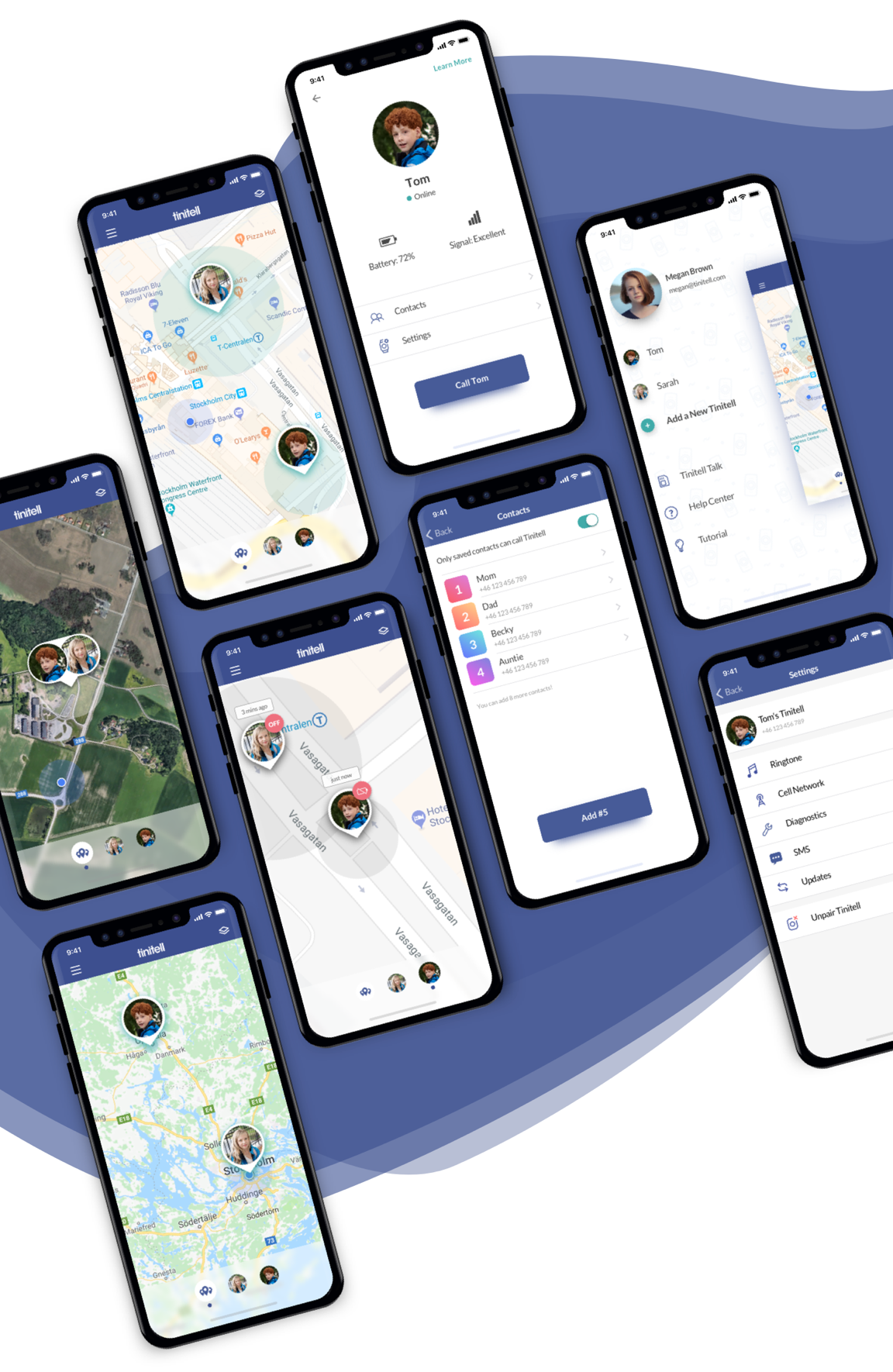
Tinitell is a wearable mobile phone for kids. Parents manage it from the Tinitell admin app.
At Tinitell, I was responsible for UX Design (iOS and Android apps) and UX Research (both device and the apps). I also created a style guide and most of the new UI elements for the apps. Within a few months, iOS and Android apps were redesigned, both visually and functionally.
Entire team put effort into improving the location services and communication with the device. That helped to create a clear design language for communicating Tinitell’s status updates. One of the improvements was distinguishing between devices that are powered OFF, out of battery or with connectivity issues.
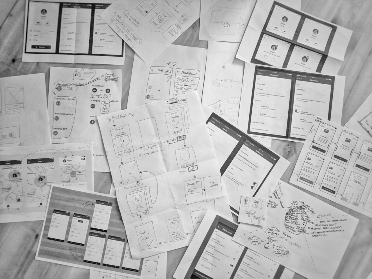
Semi-functioning prototypes of the new app were tested with 8 users – parents of kids aged 6 to 9, who have been using Tinitell for over 6 months (4 iOS and 4 Android users). Testing was accompanied by In-Depth Interviews that revealed crucial pain points and usage patterns. See inVision iOS prototype.

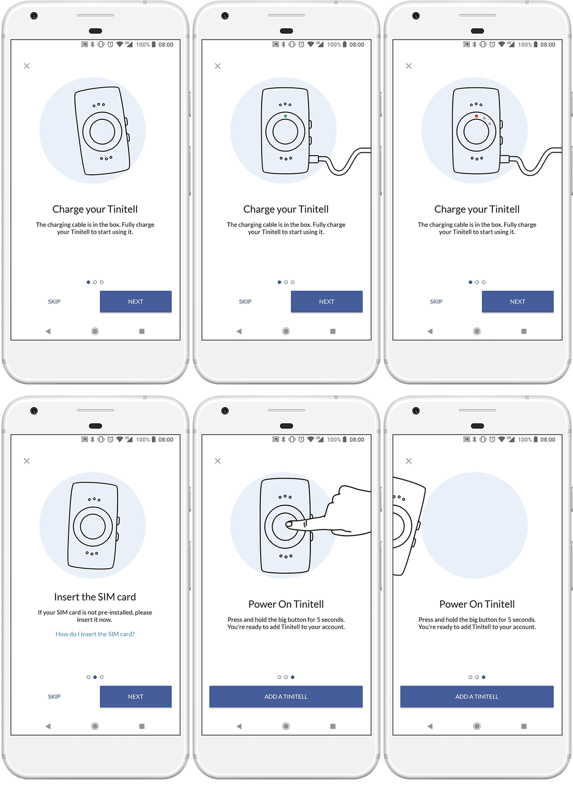
Another example of functional improvements was the onboarding flow. It was redesigned to help new users add the Tinitell to their admin account. The customers support requests and onboarding funnel analysis, together with usability testing with the new users, showed that the struggle lays in the parts that involve handling the hardware. We decided to present the most important steps of the onboarding in a form of animations (created by our graphic designer, Moa).
